


Salsa
Branding and Positioning
Digital Marketing
Art Direction
Social Media

Salsa is a Mexican restaurant in Barcelona that offers an innovative gastronomic offer based on traditional cuisine.
When they started their activity, they had a logo and a very superficial graphic identity but they realized that if they wanted to grow and evolve, they needed a solid and coherent corporate identity to build their brand.
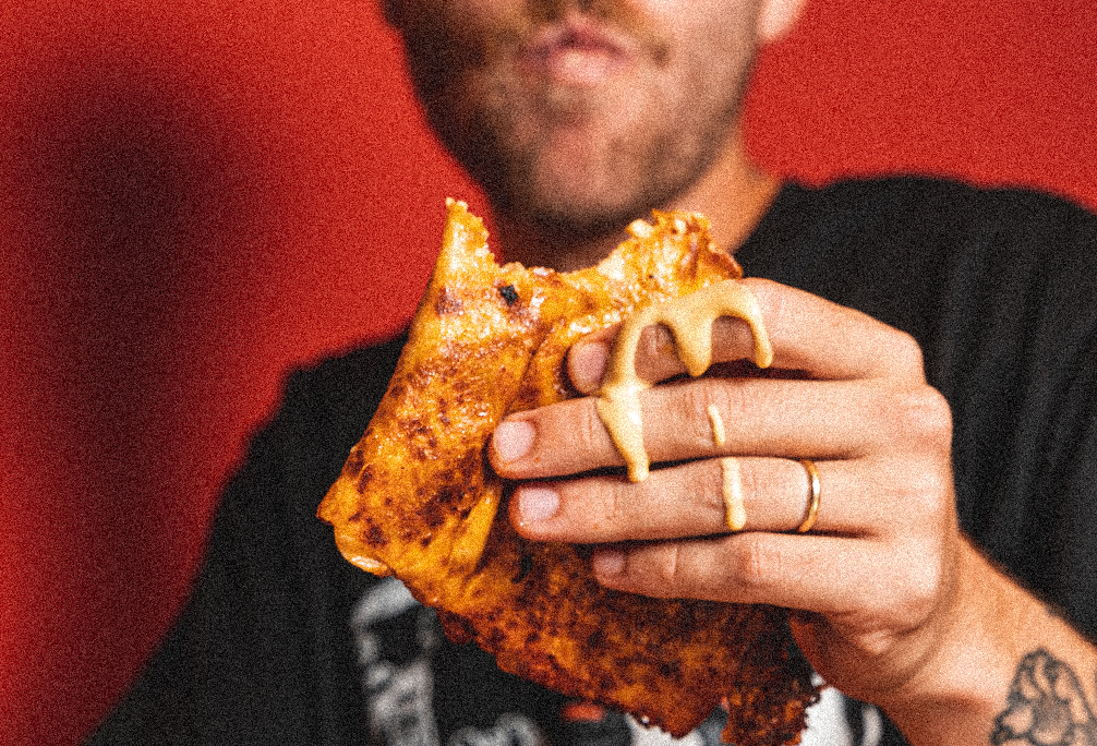
Our aim was to express their Mexican identity without falling into all the clichés.
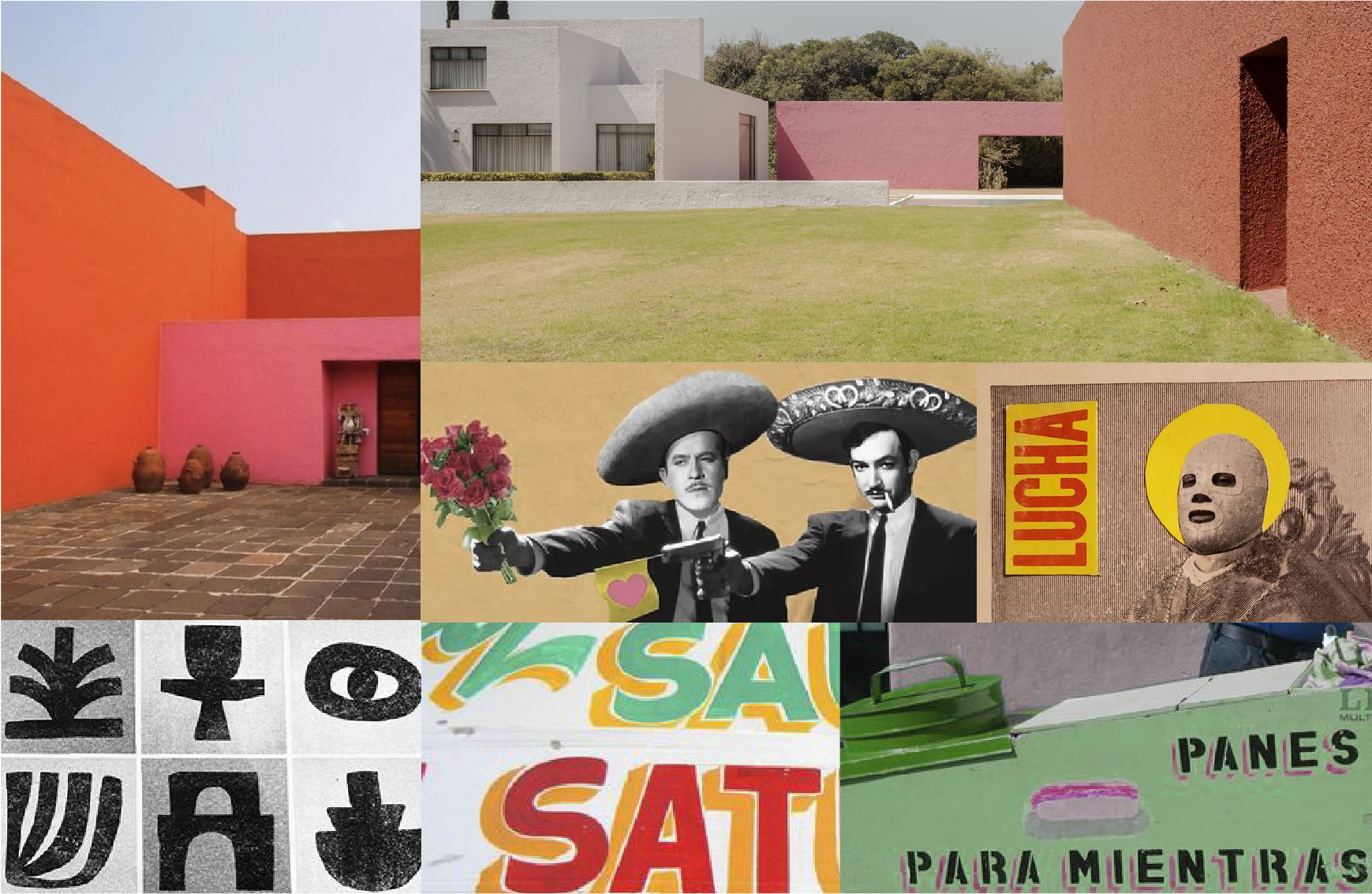
We were inspired by the day-to-day culture: the desire to always have a good time with their compadres, the essence of street food and neo-Mexicanism, an artistic movement that combines popular elements with modern ones.
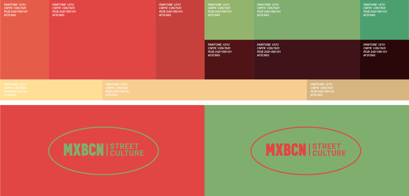
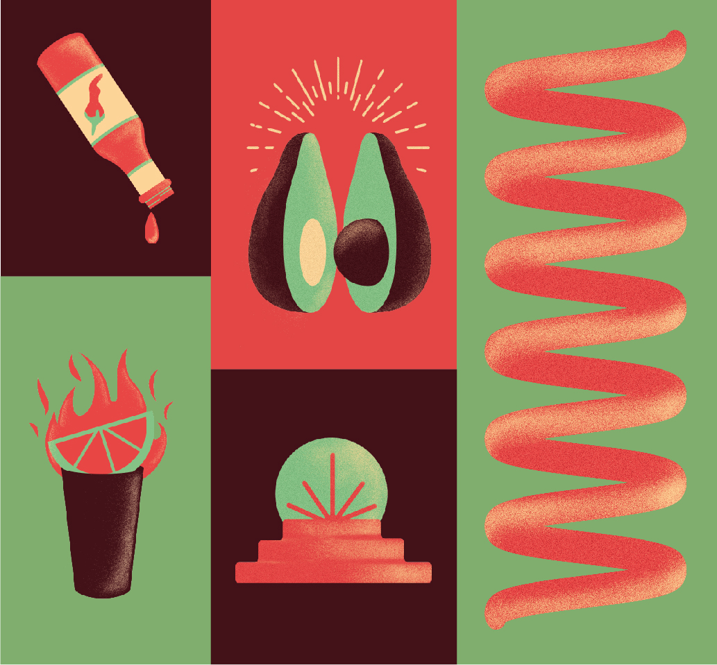
We wanted to carry over the spicy flavours of Mexican sauces to the brand's chromatic range. Thus, we created the "spicy visual" concept, which plays with the vibration of red and green, and accompanied them with two other mellow colours for balance.
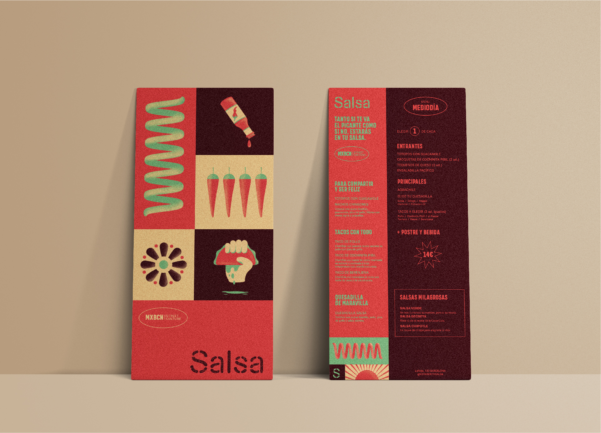
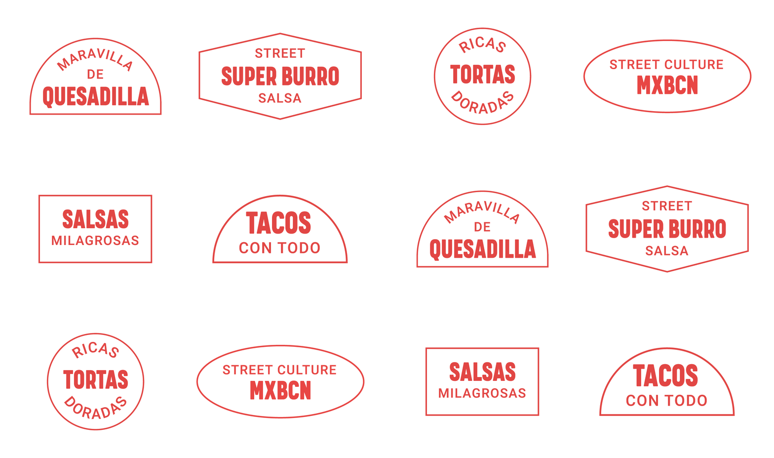
This palette, together with the stamps, icons and images created from neo-Mexicanism, present us with a complete visual universe.

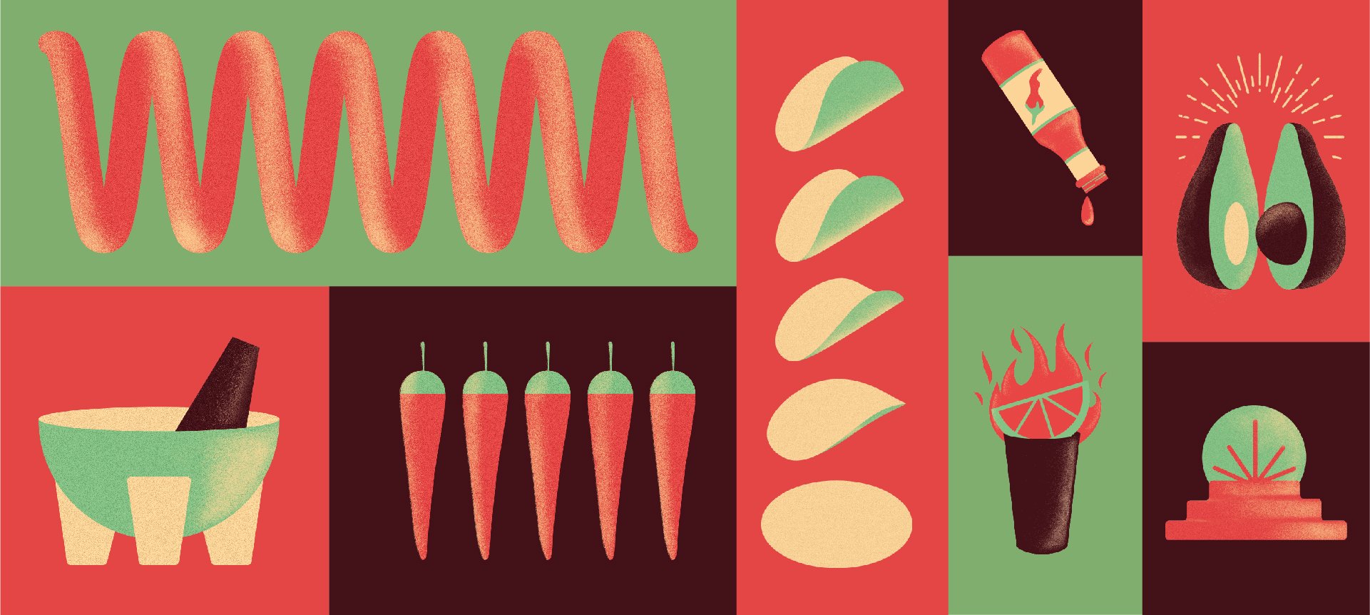
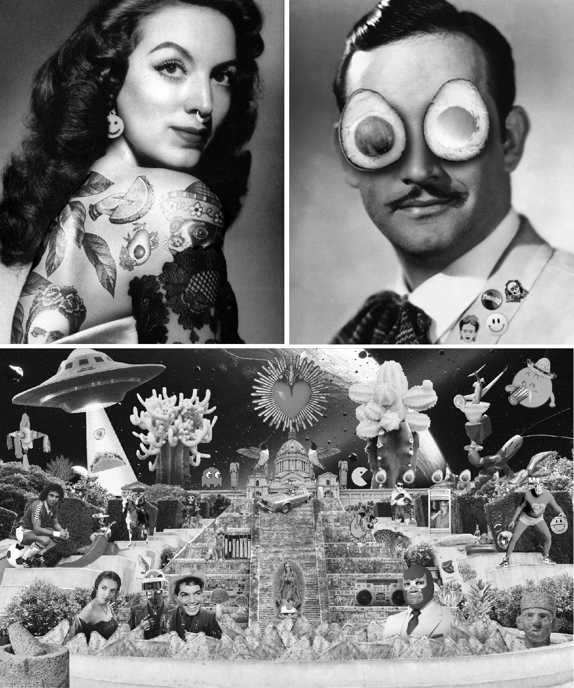
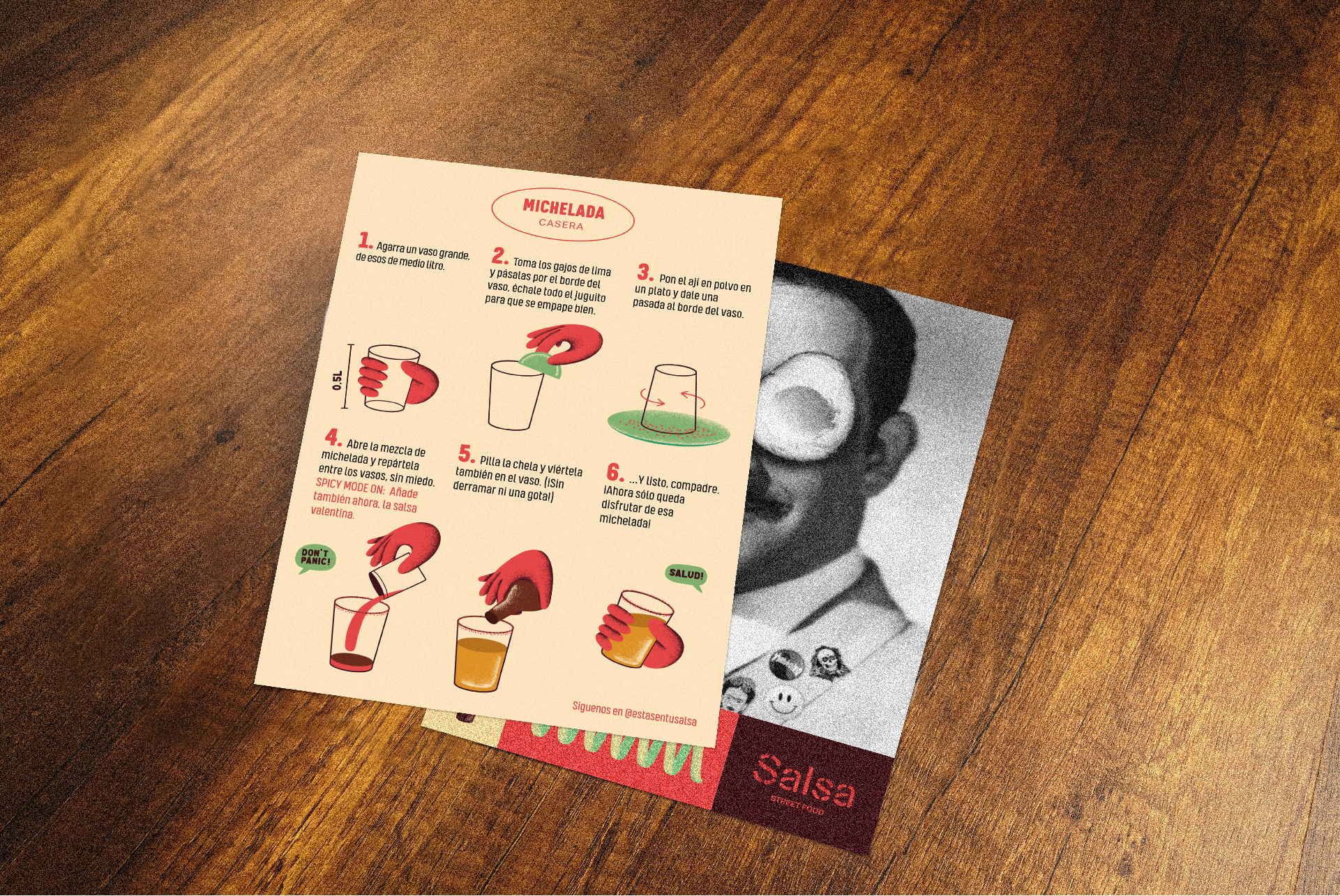
Adding a relaxed and cheerful tone of communication with Mexican expressions and slang, we achieve a brand with personality and easily recognisable.
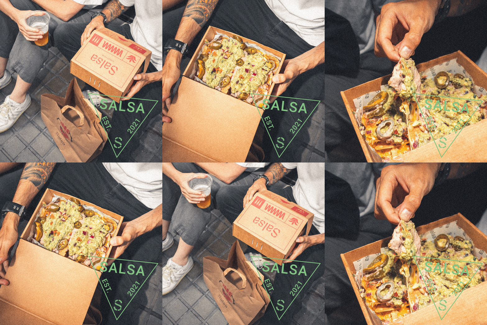
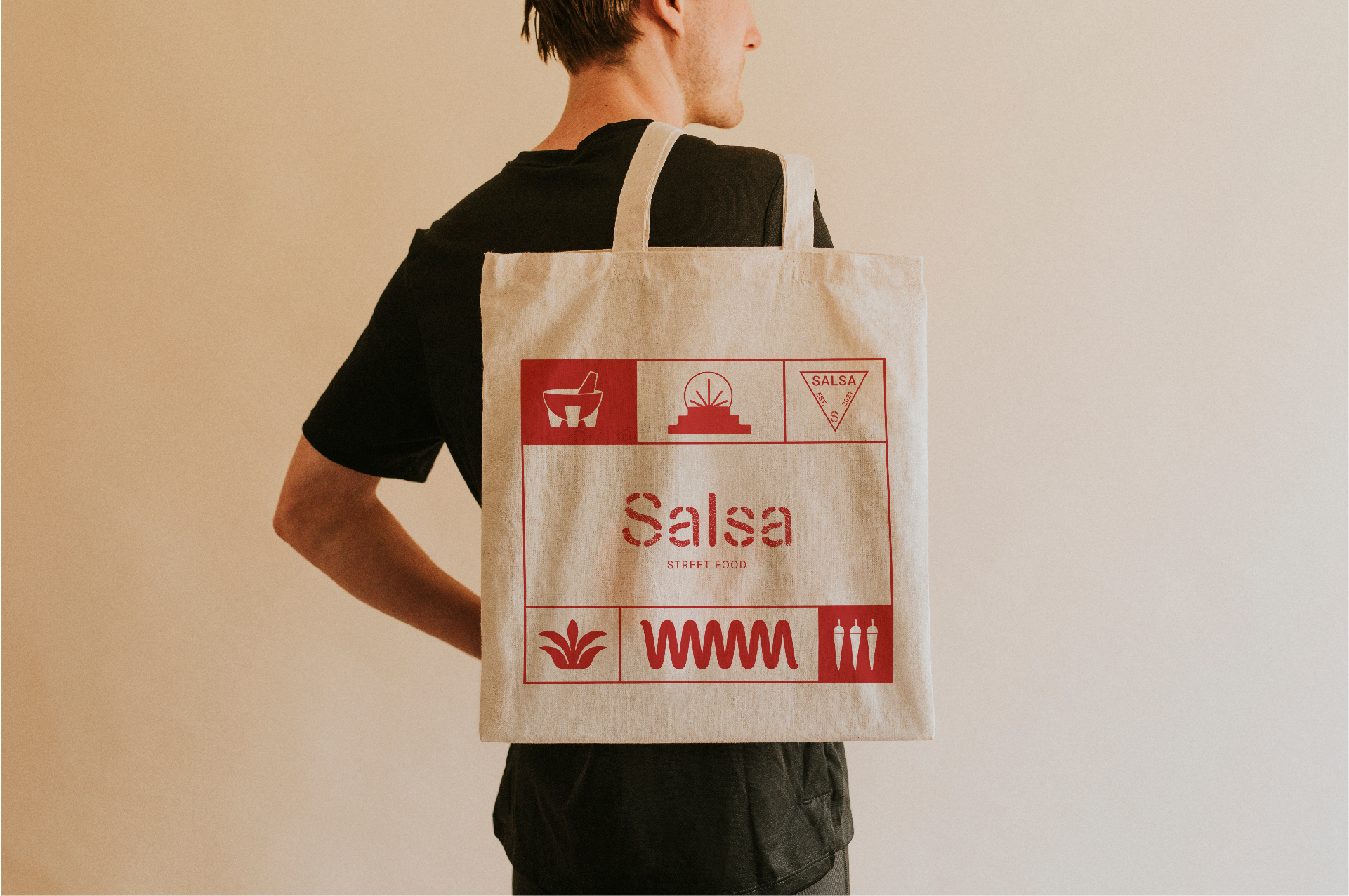
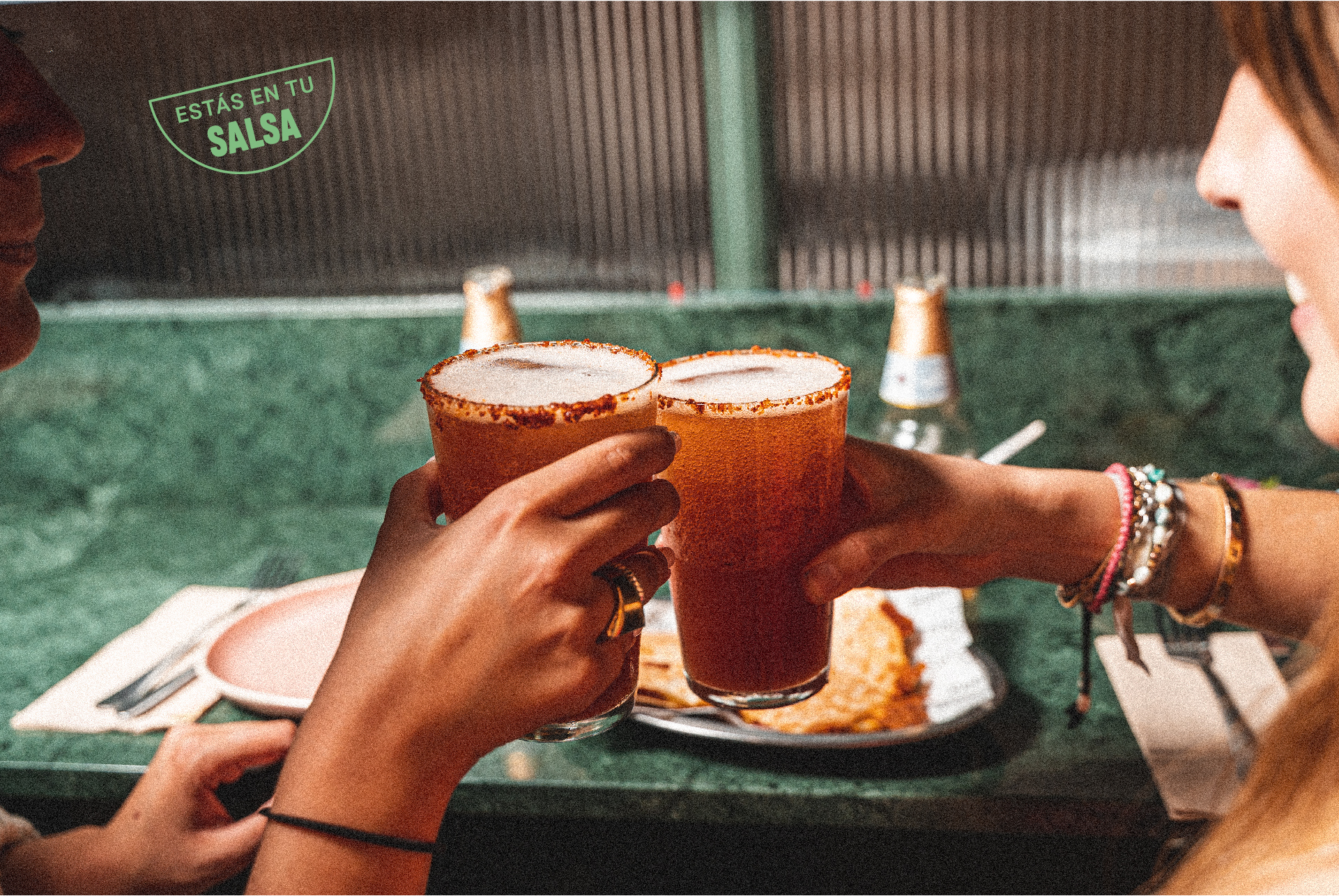
Playing with the different graphic elements, we used a modular system to create the different applications: menu, packaging, merchandising, all the advertising material, communication on social networks and even the decoration of the restaurant.





↑
See Again

Salsa
Branding and Positioning
Digital Marketing
Art Direction
Social Media

Salsa is a Mexican restaurant in Barcelona that offers an innovative gastronomic offer based on traditional cuisine.
When they started their activity, they had a logo and a very superficial graphic identity but they realized that if they wanted to grow and evolve, they needed a solid and coherent corporate identity to build their brand.

Our aim was to express their Mexican identity without falling into all the clichés.
We were inspired by the day-to-day culture: the desire to always have a good time with their compadres, the essence of street food and neo-Mexicanism, an artistic movement that combines popular elements with modern ones.

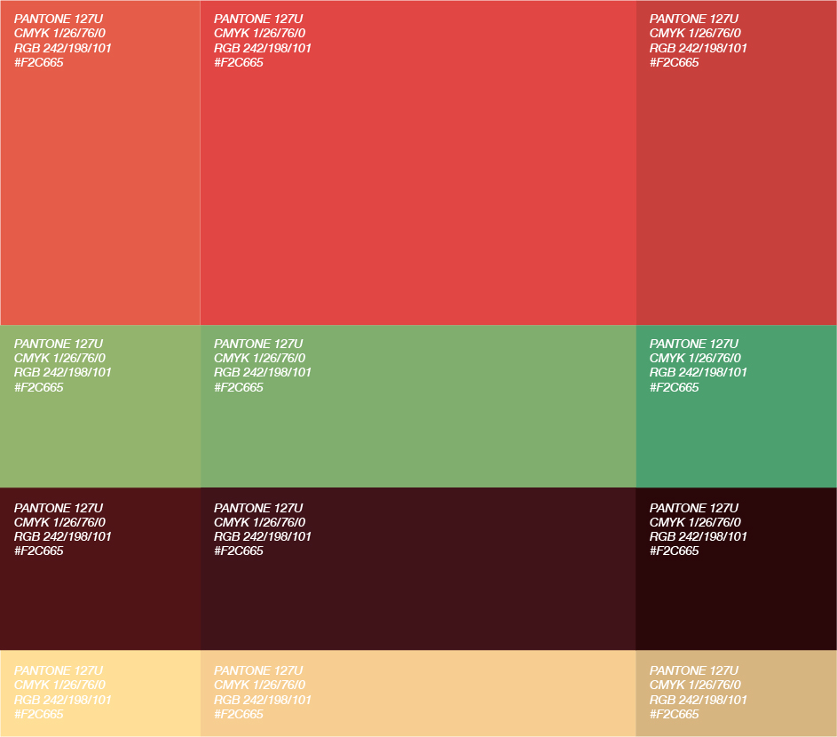
We wanted to carry over the spicy flavours of Mexican sauces to the brand's chromatic range. Thus, we created the "spicy visual" concept, which plays with the vibration of red and green, and accompanied them with two other mellow colours for balance.
This palette, together with the stamps, icons and images created from neo-Mexicanism, present us with a complete visual universe.


Adding a relaxed and cheerful tone of communication with Mexican expressions and slang, we achieve a brand with personality and easily recognisable.
Playing with the different graphic elements, we used a modular system to create the different applications: menu, packaging, merchandising, all the advertising material, communication on social networks and even the decoration of the restaurant.


↑
See Again