


Munich
↓
Brand Identity
Art direction
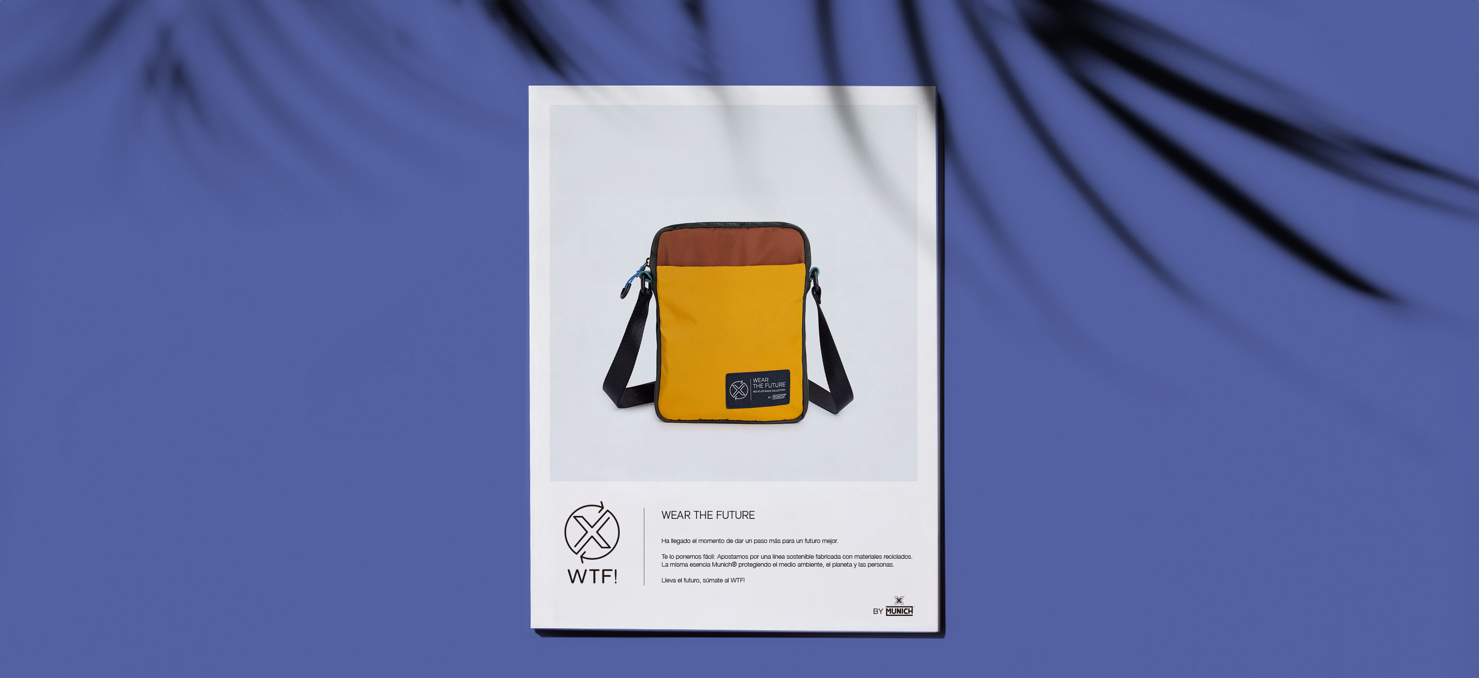
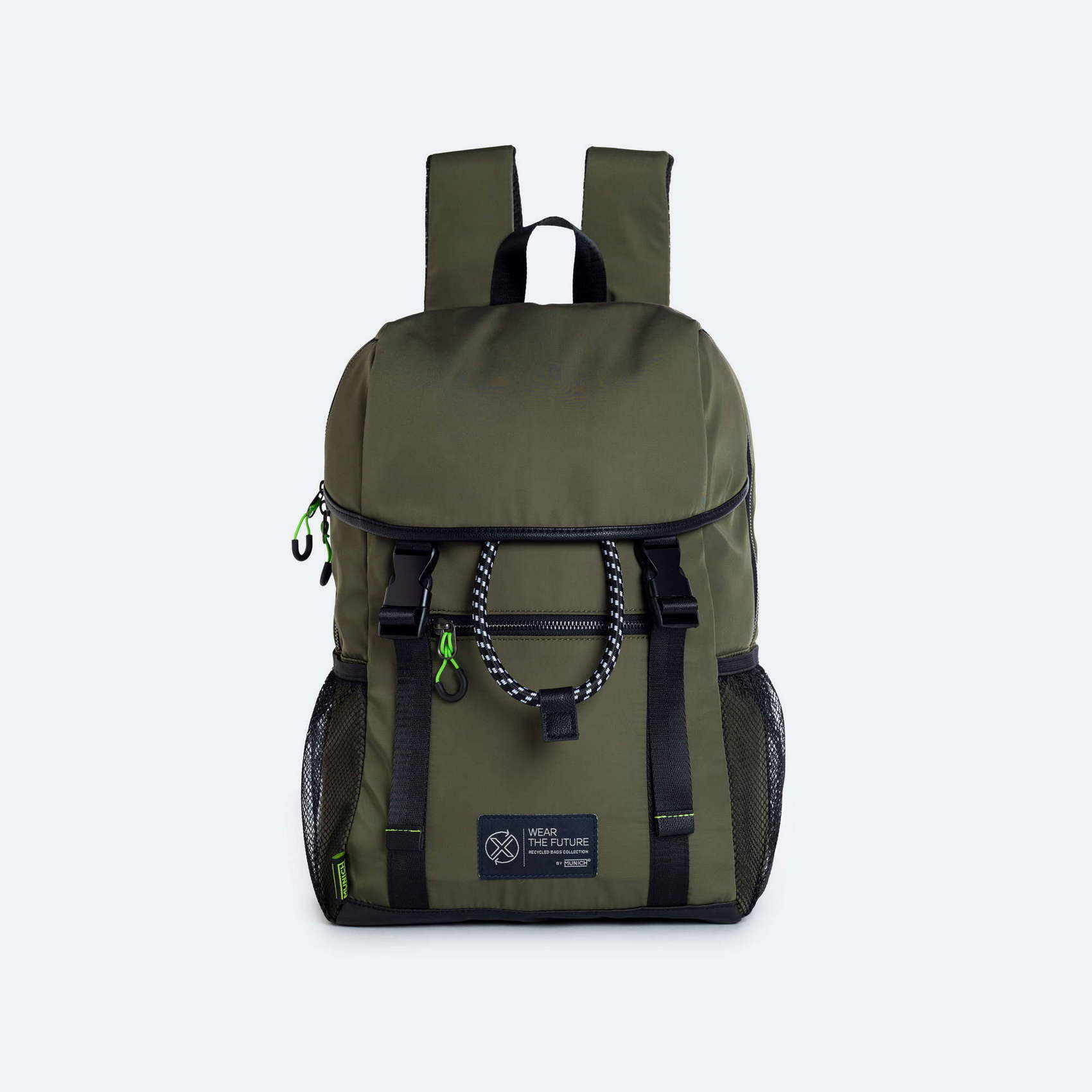
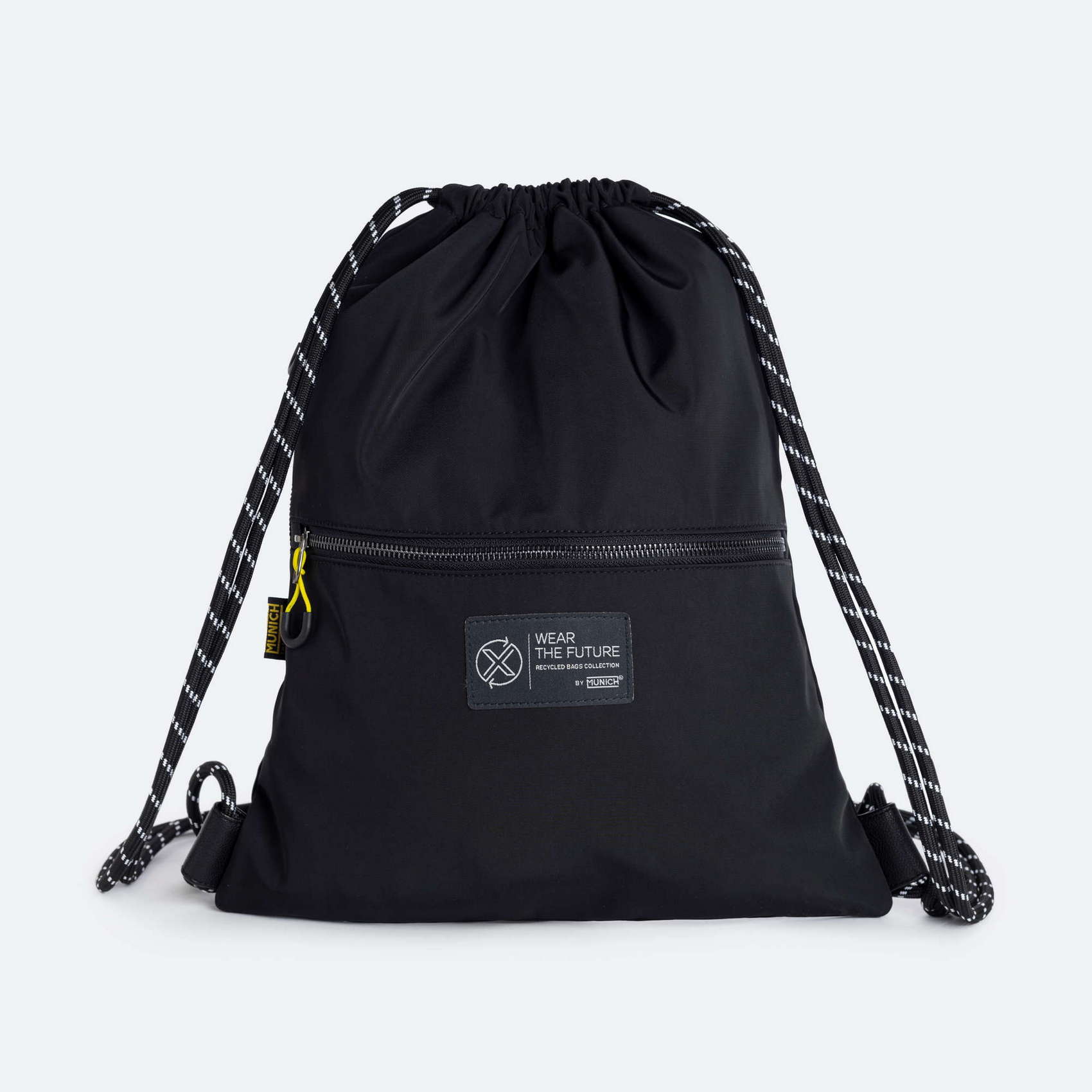
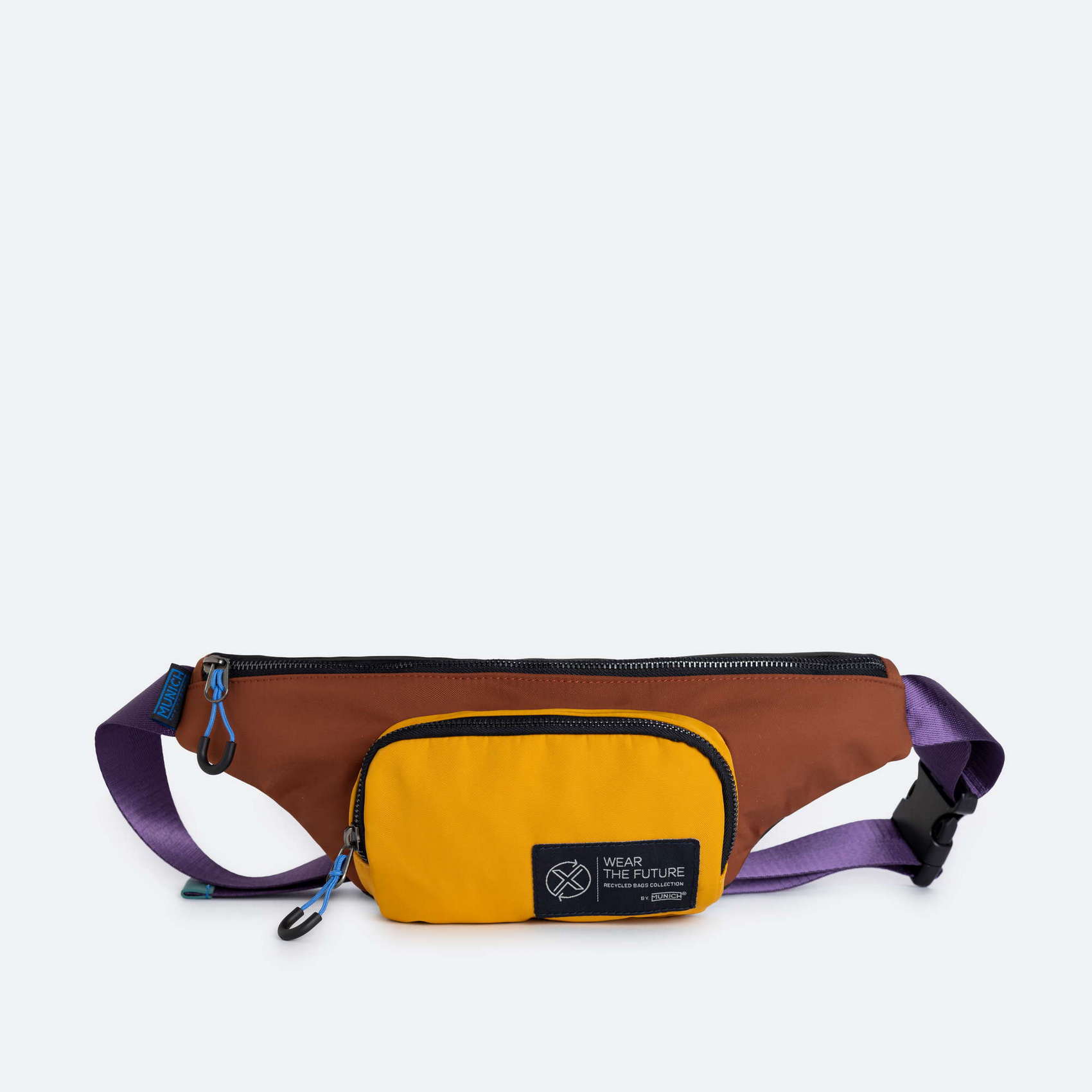
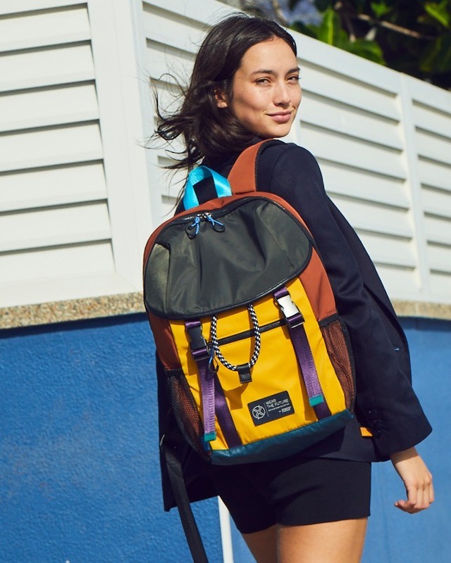
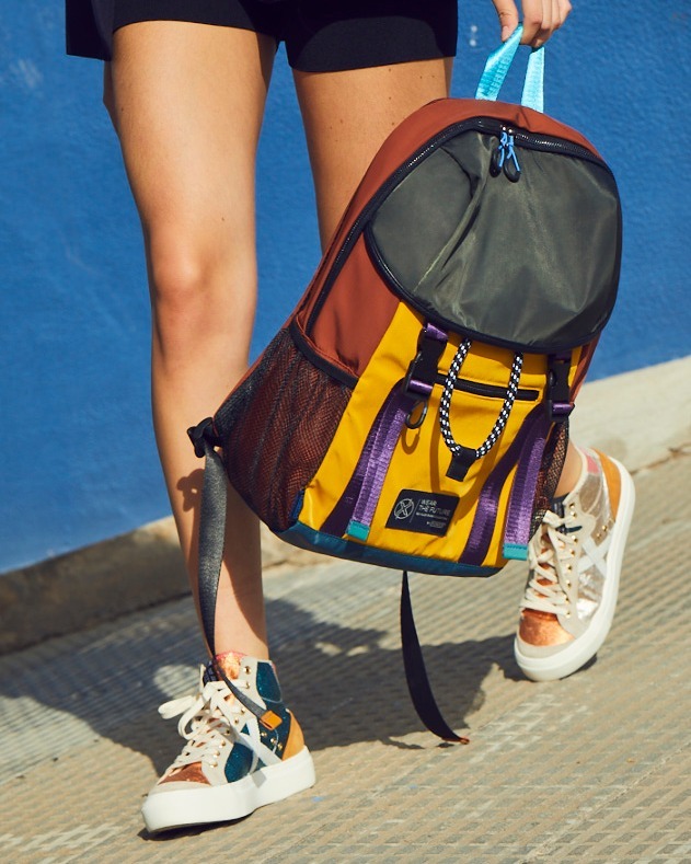
The footwear brand Munich was working on a new line of products that are committed to sustainability and made 100% from recycled materials.
But firstly, they were in need of a specific image for this new range that should be distinguishable but still consistent with the brand, in terms of naming and graphics.
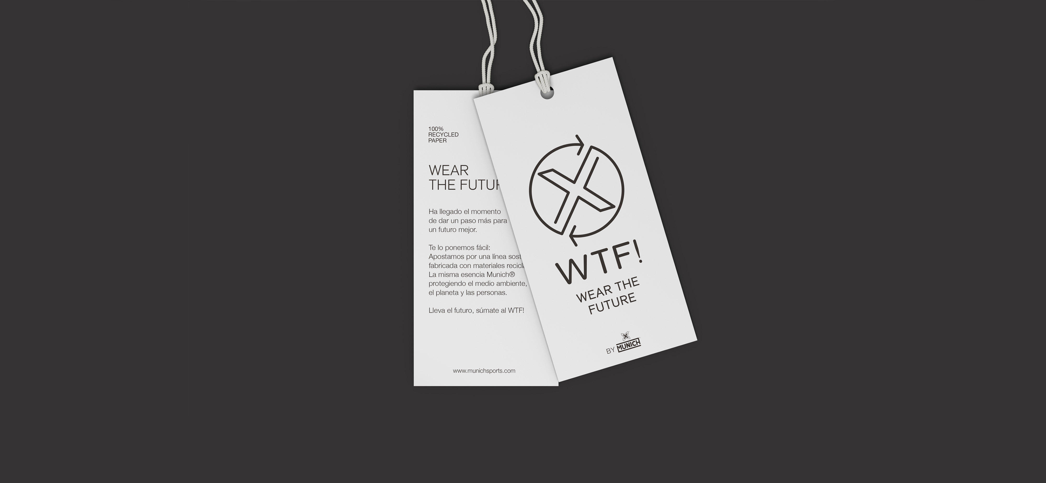
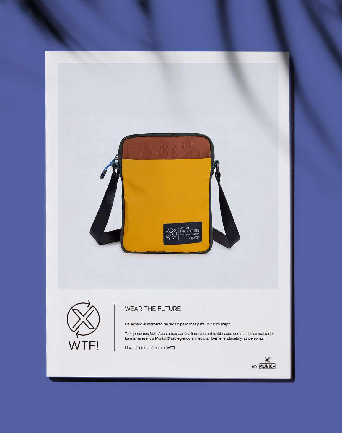
The visual application was born from their iconic X joined to the sustainability sign, achieving a very neat design that is results really easy to understand.
We brought out the brand's own rogue side to name it WTF! (Wear The Future), which aims to denounce while expressing the brand's environmental commitment with this new line.
↑
See Again
Munich
↓
Brand Identity
Art direction

The footwear brand Munich was working on a new line of products that are committed to sustainability and made 100% from recycled materials.
But firstly, they were in need of a specific image for this new range that should be distinguishable but still consistent with the brand, in terms of naming and graphics.
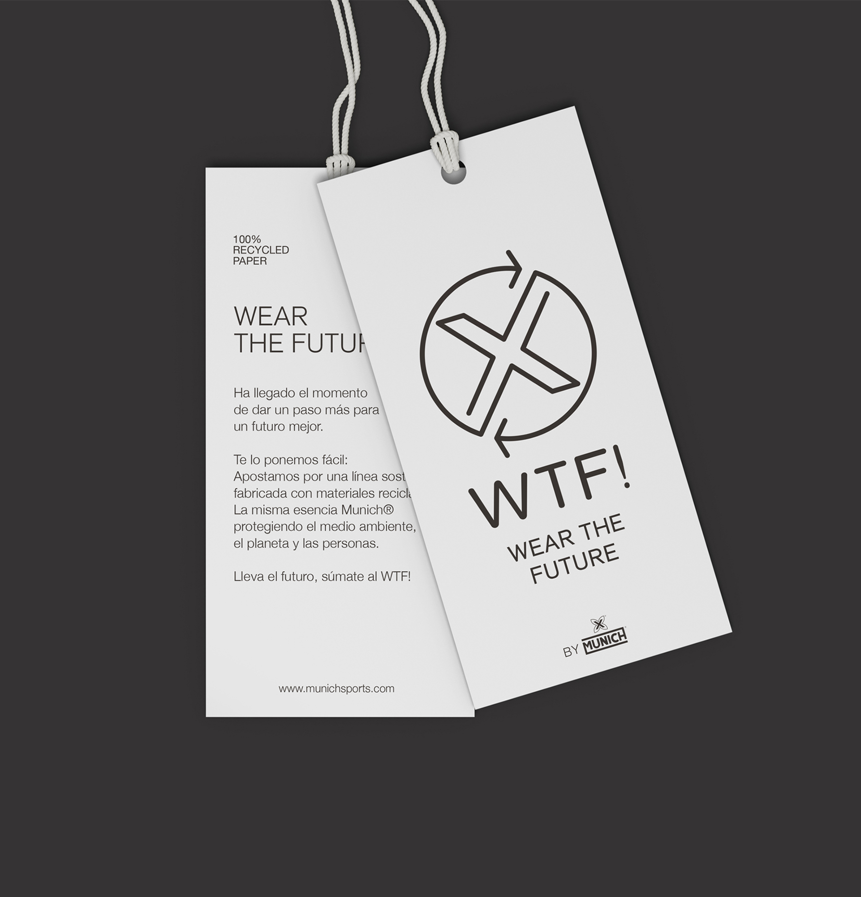
The visual application was born from their iconic X joined to the sustainability sign, achieving a very neat design that is results really easy to understand.
We brought out the brand's own rogue side to name it WTF! (Wear The Future), which aims to denounce while expressing the brand's environmental commitment with this new line.




↑
See Again