


HAAN
↓
Turning care around
HAAN is a personal care brand that started in 2019 to instill the habit of hand sanitizers in Europe, a product that was already popular in the States. But, once the pandemic hit, it quickly became a best-seller.
Nonetheless, many months of work had gone into carefully developing every detail to create a strong brand that could allow growth on a steady and well-defined basis, under the same DNA: easy, portable and trendy.
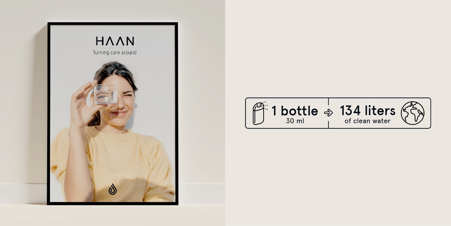
Seeking how to add extra value, we included a social project against the global water crisis, that would contribute to safe drinking water in developing countries in Africa.
That way, the brand would have two sides: Ready to Care (a functional benefit to the consumer) and Ready to Change (the social profit).


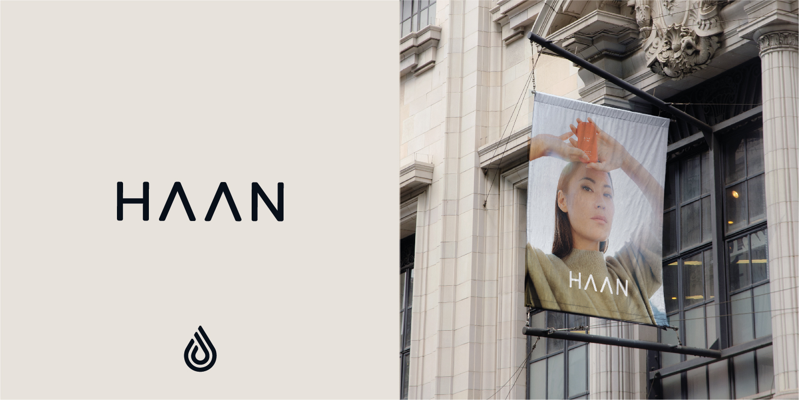
Starting with the name of the brand and keeping in mind that initially would be focused on hand care, we took creative liberty to turn the word "hand" into "HAAN". Out of it, we created a typographic logo with very straight lines that would be paired with an isotype of a water drop.
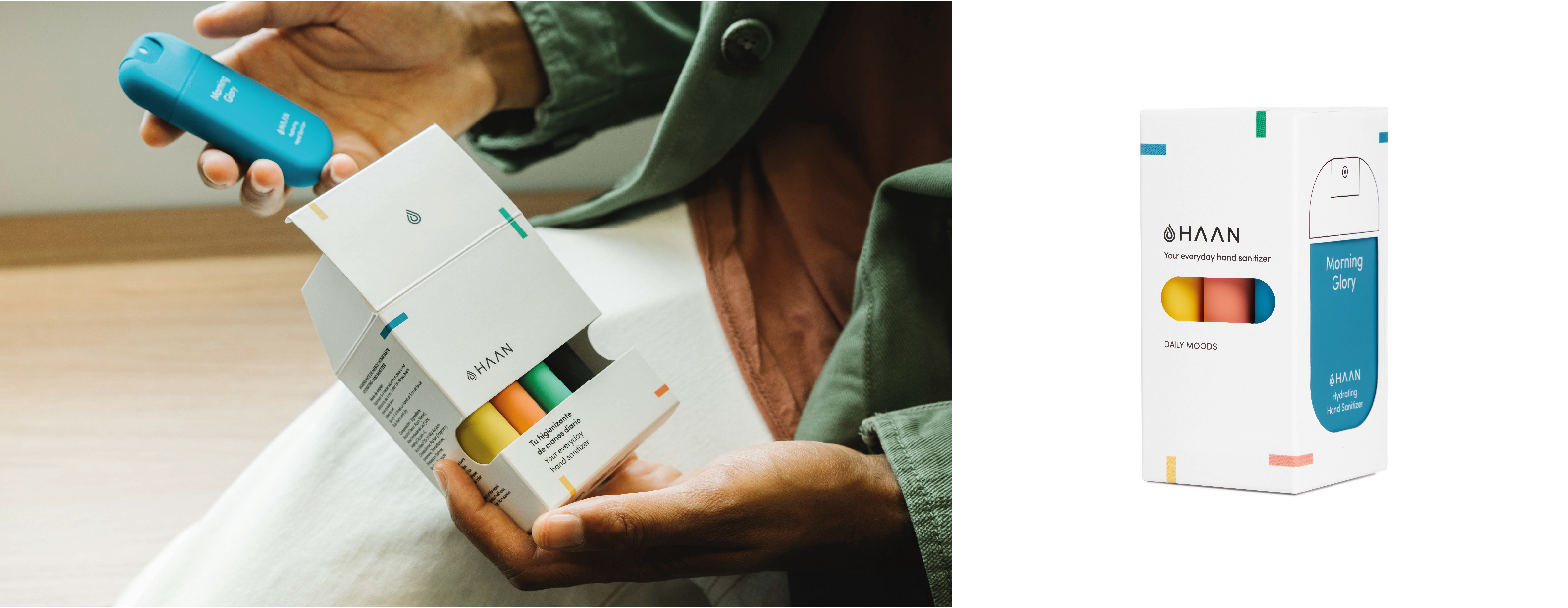
We were also deeply involved with the product development: to decide which fragrances would be release and giving them a naming and colour under a joint concept.
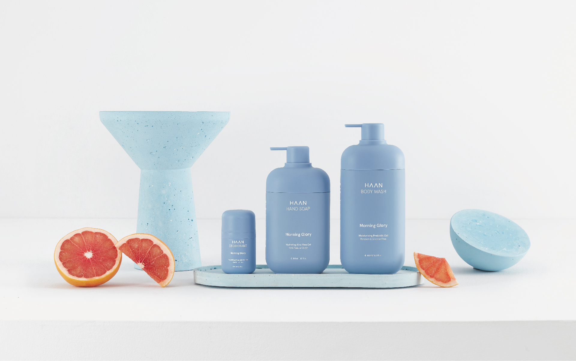
After their great success, they naturally expanded their product line. Not only with new hand sanitizer collections but also with other categories such as hand and body soaps and lotions or toothpaste; in which we were also involved in their development and launch.
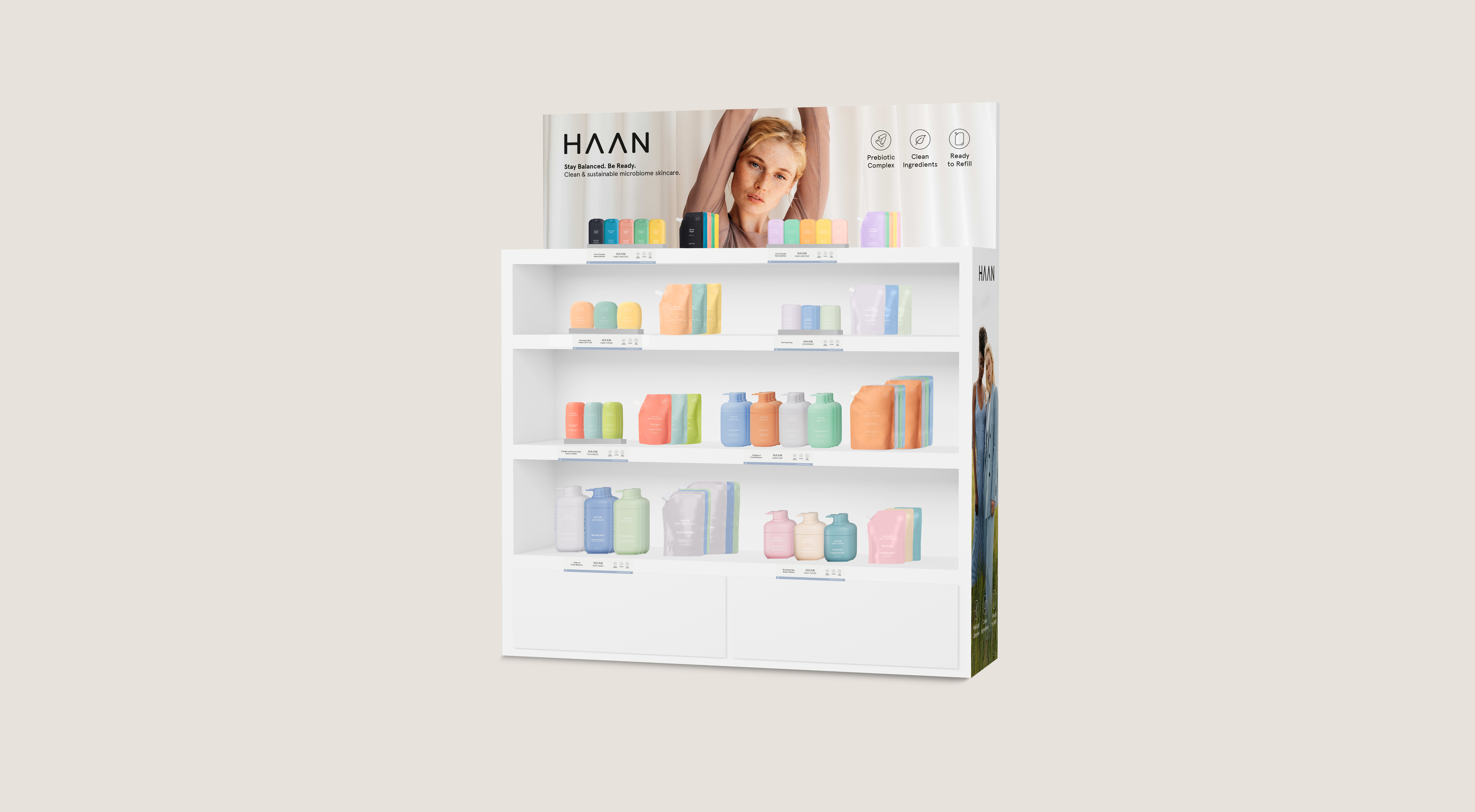
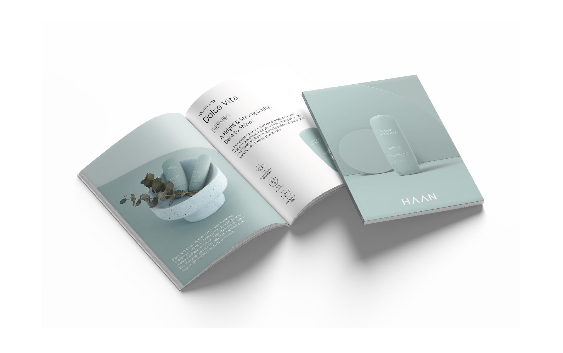
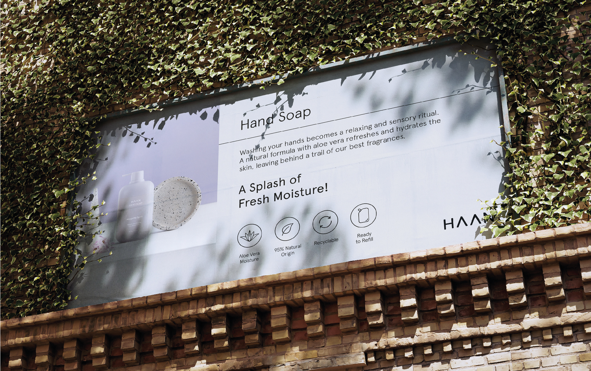
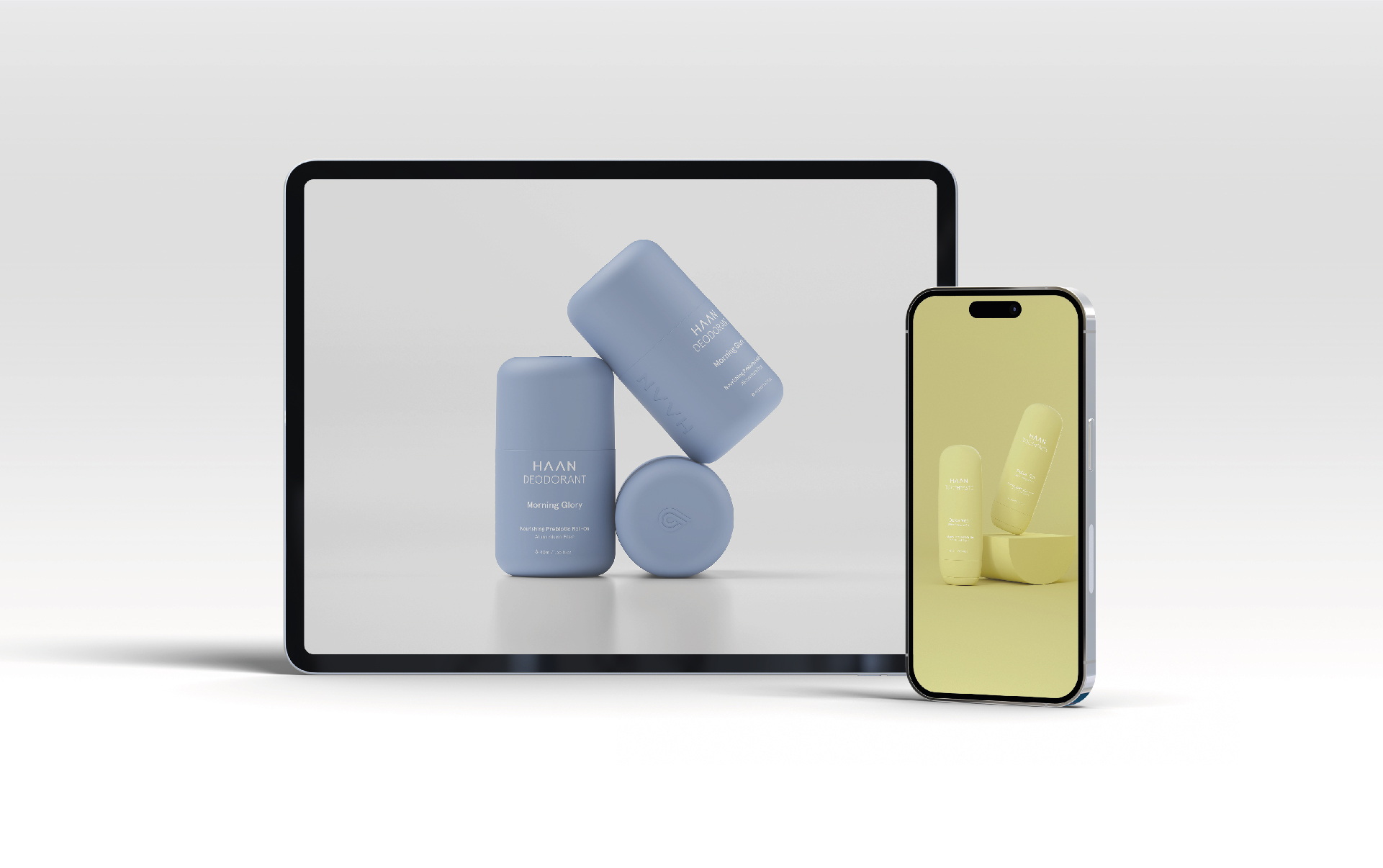
In between, we were in charge of designing all their visual needs: from offline materials like its packaging, leaflets, catalogs, prints or displays to their online presence such as their website, social media and photo/video production, among many other assets.




↑
See Again

HAAN
↓
Turning care around
HAAN is a personal care brand that started in 2019 to instill the habit of hand sanitizers in Europe, a product that was already popular in the States. But, once the pandemic hit, it quickly became a best-seller.
Nonetheless, many months of work had gone into carefully developing every detail to create a strong brand that could allow growth on a steady and well-defined basis, under the same DNA: easy, portable and trendy.


Seeking how to add extra value, we included a social project against the global water crisis, that would contribute to safe drinking water in developing countries in Africa.
That way, the brand would have two sides: Ready to Care (a functional benefit to the consumer) and Ready to Change (the social profit).


Starting with the name of the brand and keeping in mind that initially would be focused on hand care, we took creative liberty to turn the word "hand" into "HAAN". Out of it, we created a typographic logo with very straight lines that would be paired with an isotype of a water drop.
We were also deeply involved with the product development: to decide which fragrances would be release and giving them a naming and colour under a joint concept.

After their great success, they naturally expanded their product line. Not only with new hand sanitizer collections but also with other categories such as hand and body soaps and lotions or toothpaste; in which we were also involved in their development and launch.
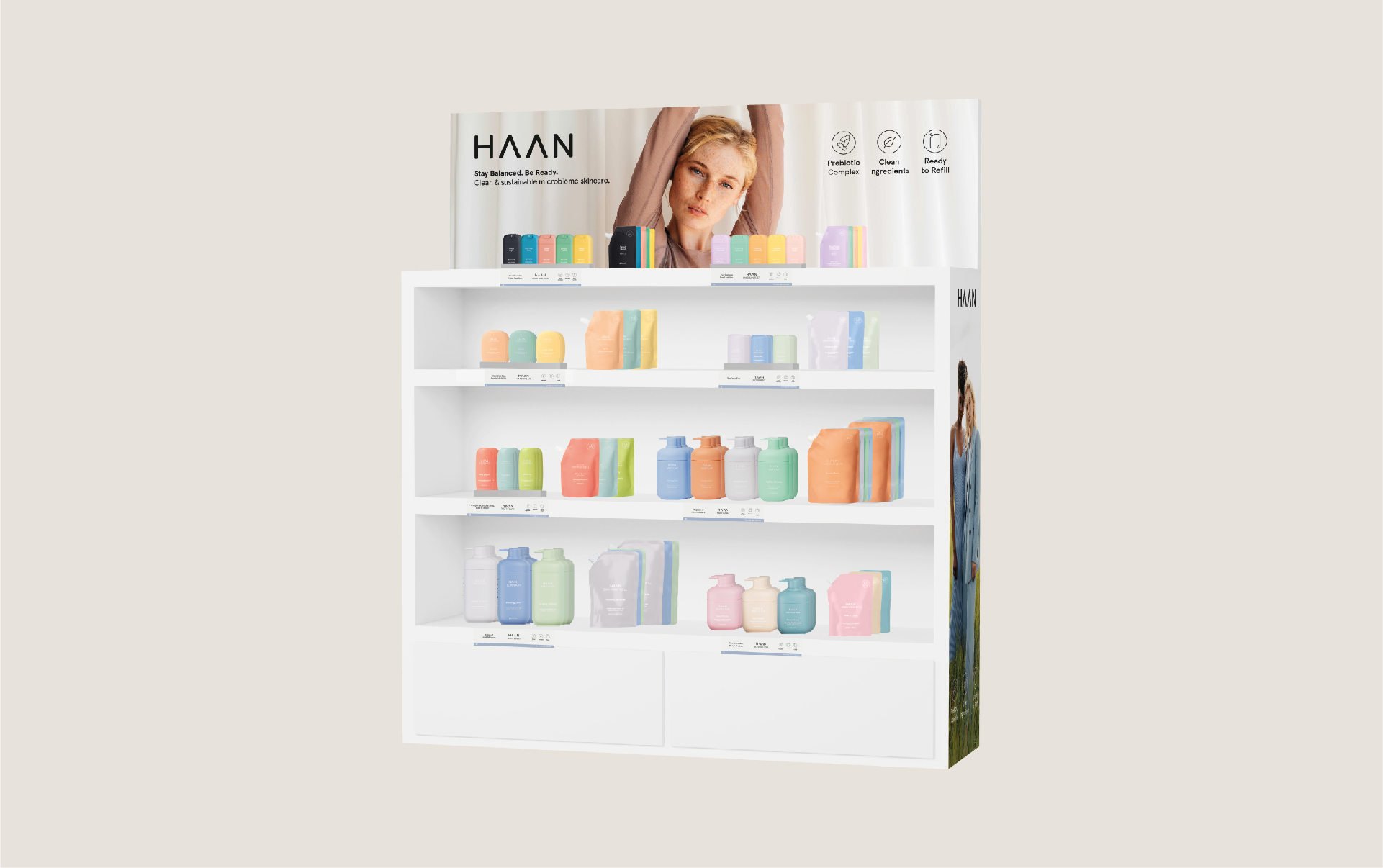
In between, we were in charge of designing all their visual needs: from offline materials like its packaging, leaflets, catalogs, prints or displays to their online presence such as their website, social media and photo/video production, among many other assets.


↑
See Again