


Brân
Brand Identity
Art Direction
Packaging
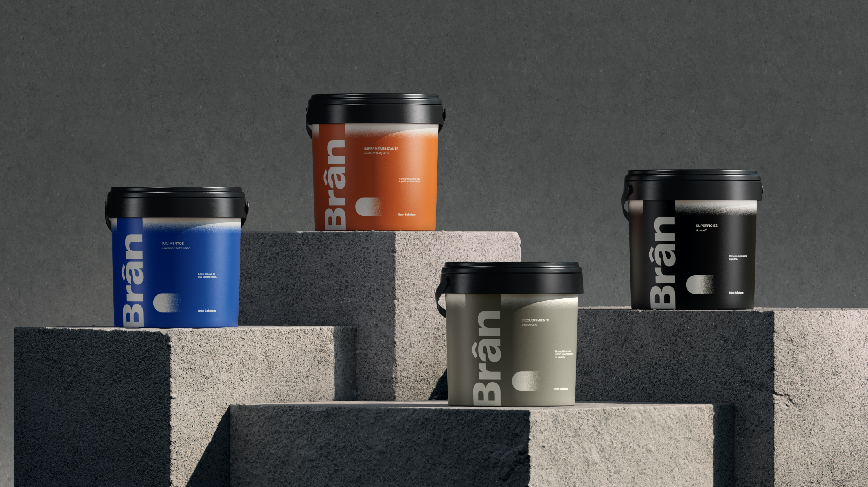
This is how Brân is born: a brand of paints and coatings for construction professionals that emerges from the expertise of a previous family business but with the desire to revolutionize the construction industry.
The most important thing in this industry is to offer reliability and security, so we positioned the brand from the archetype of the Sage. We created a brand that, thanks to a prior experience of over 40 years, enables us to provide credibility and transparency on a product of high protection and great durability.
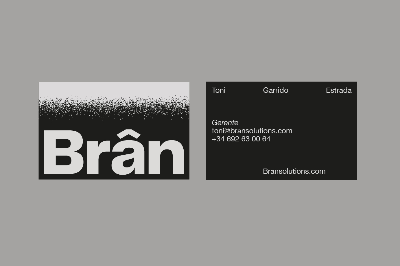
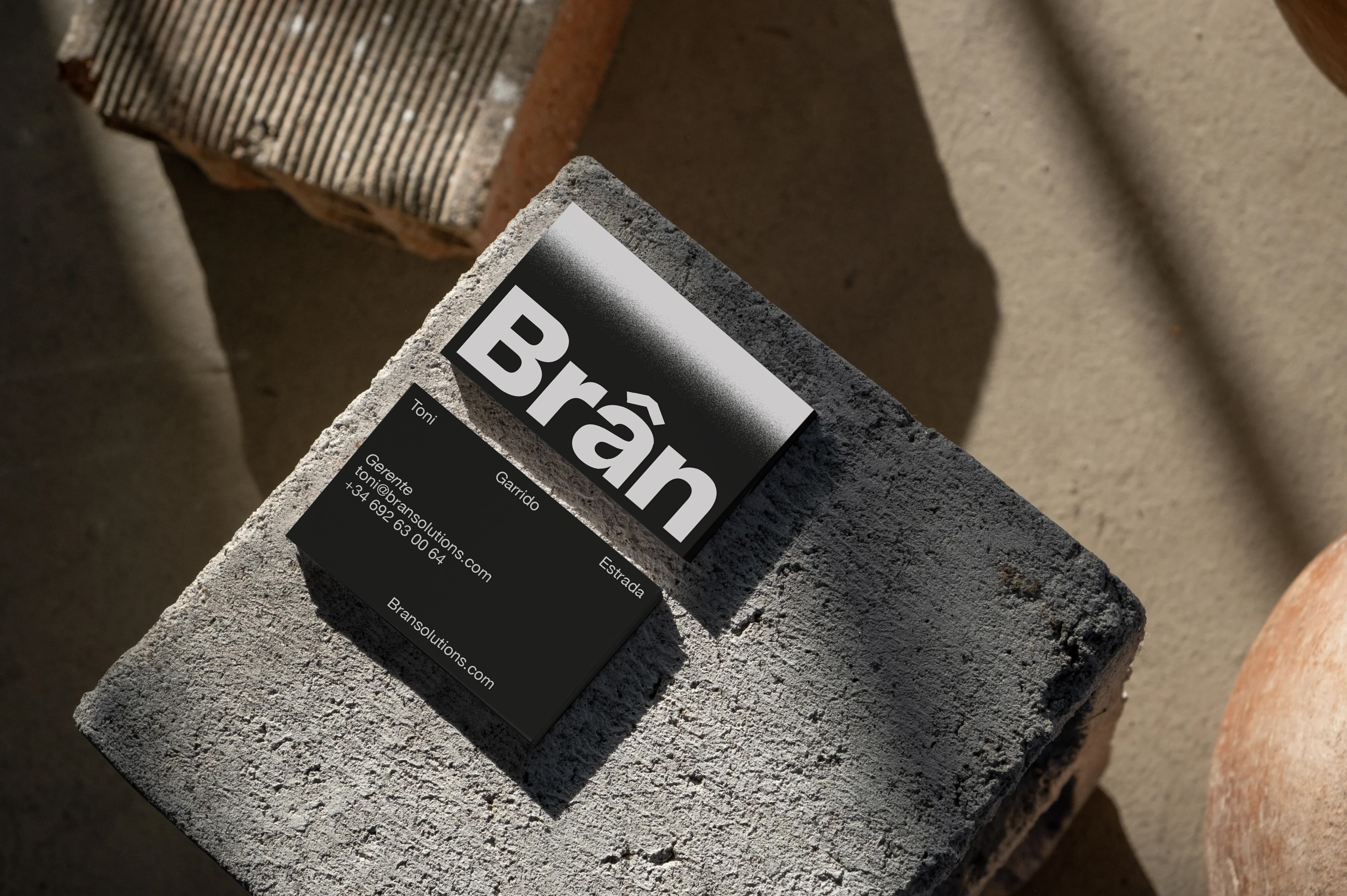
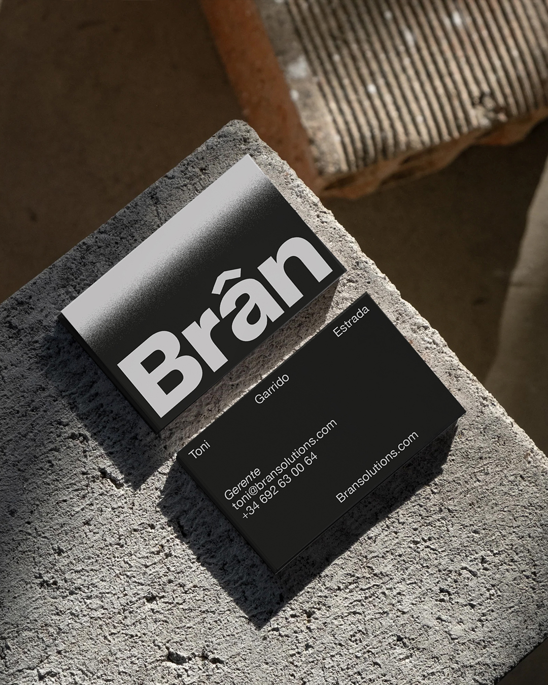
Its naming comes from the Welsh god of protection, a name that is easy to pronounce and remember. Its circumflex accent evokes the shape of a roof, making it distinctive and recognizable.
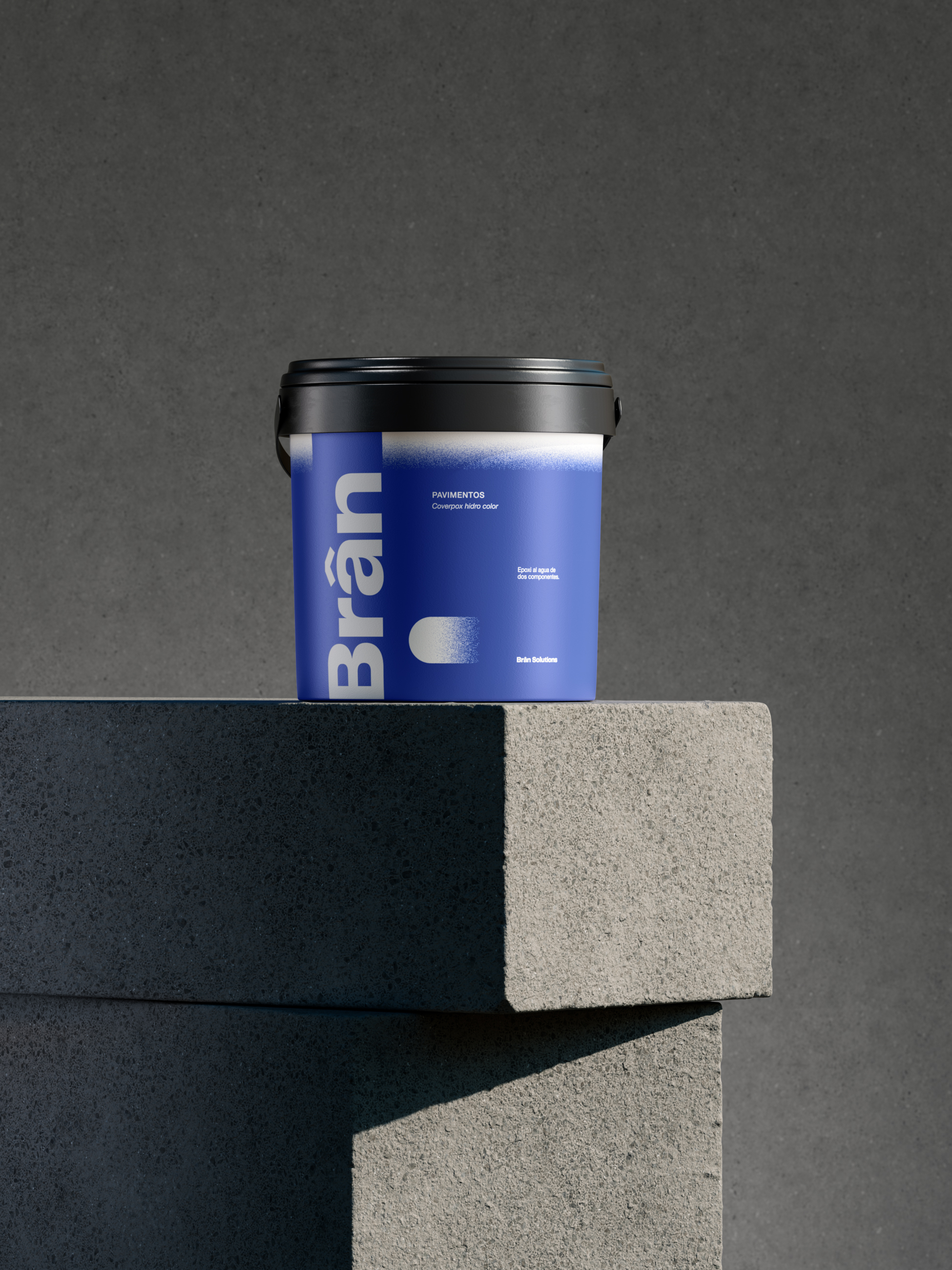
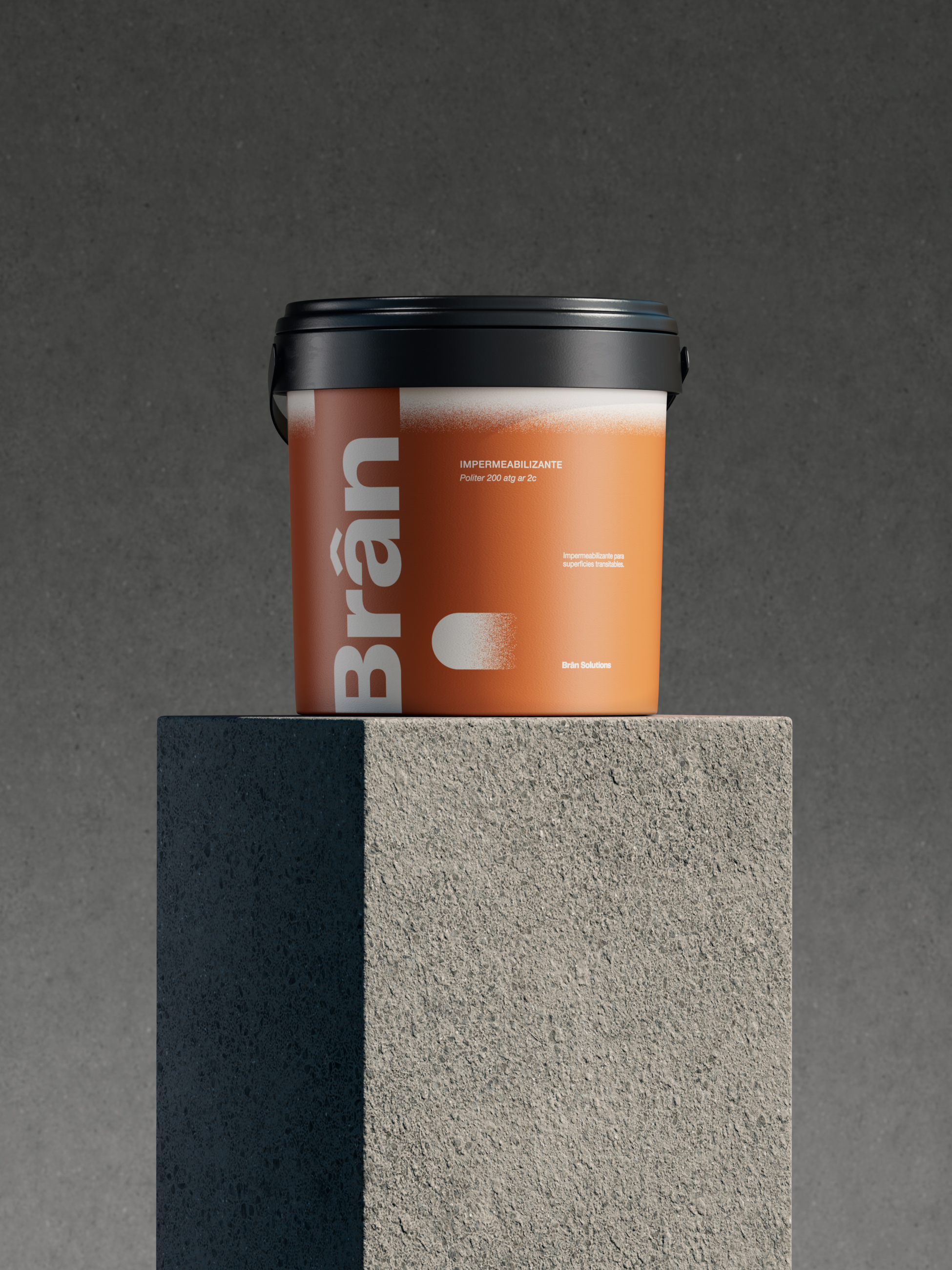
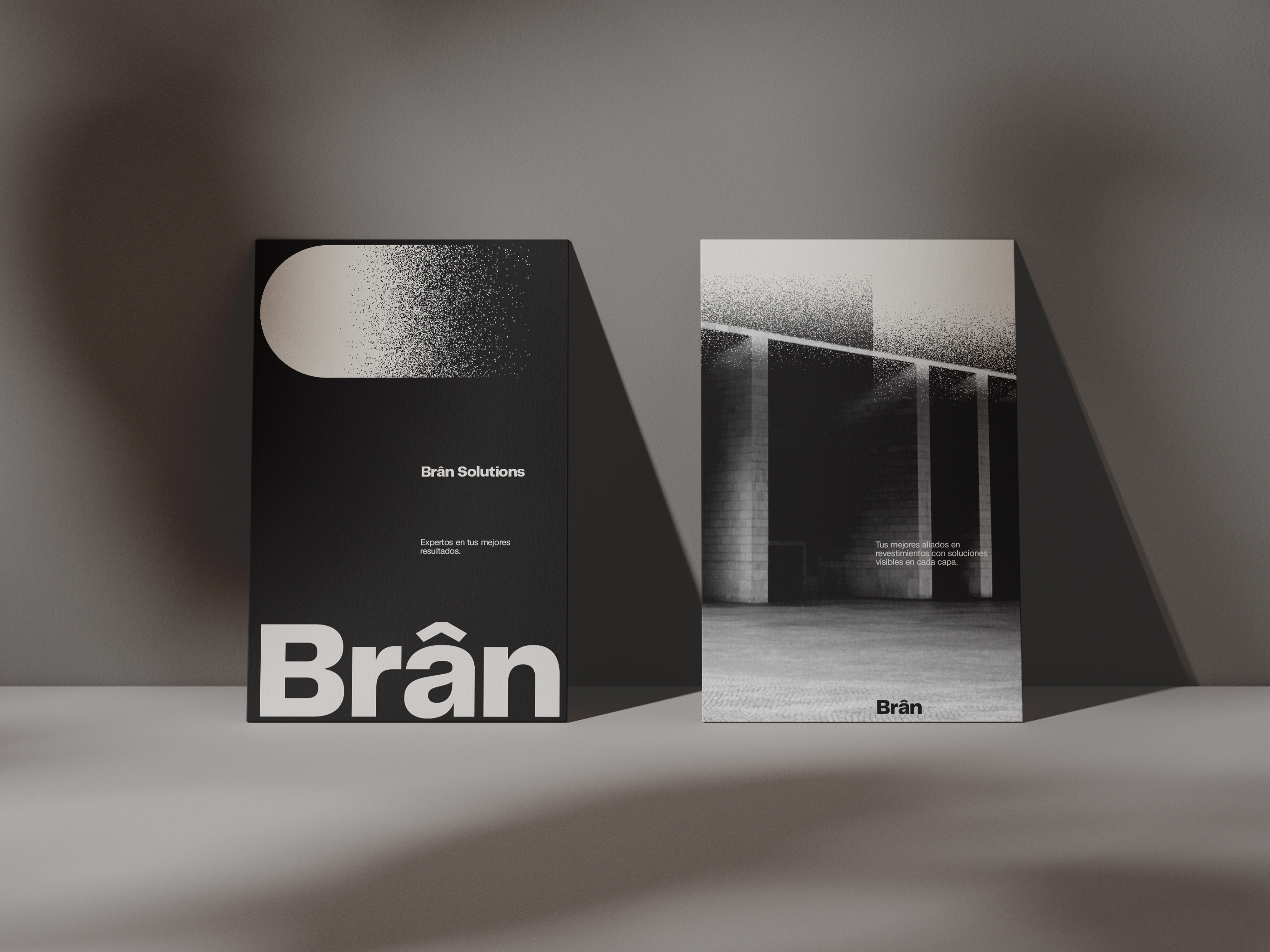
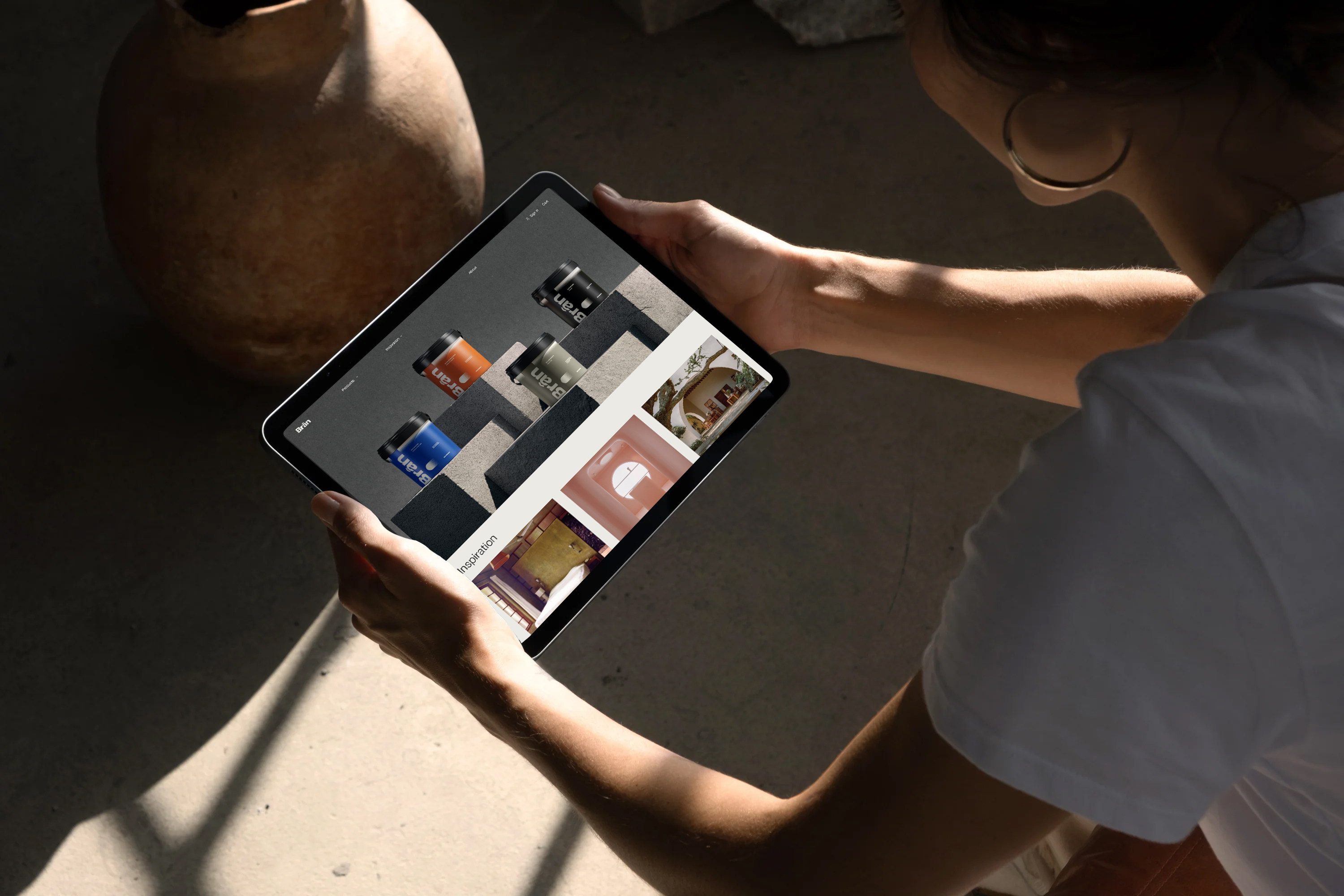
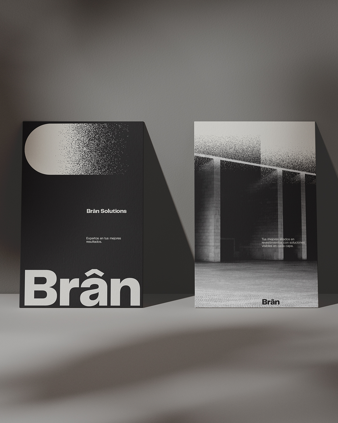
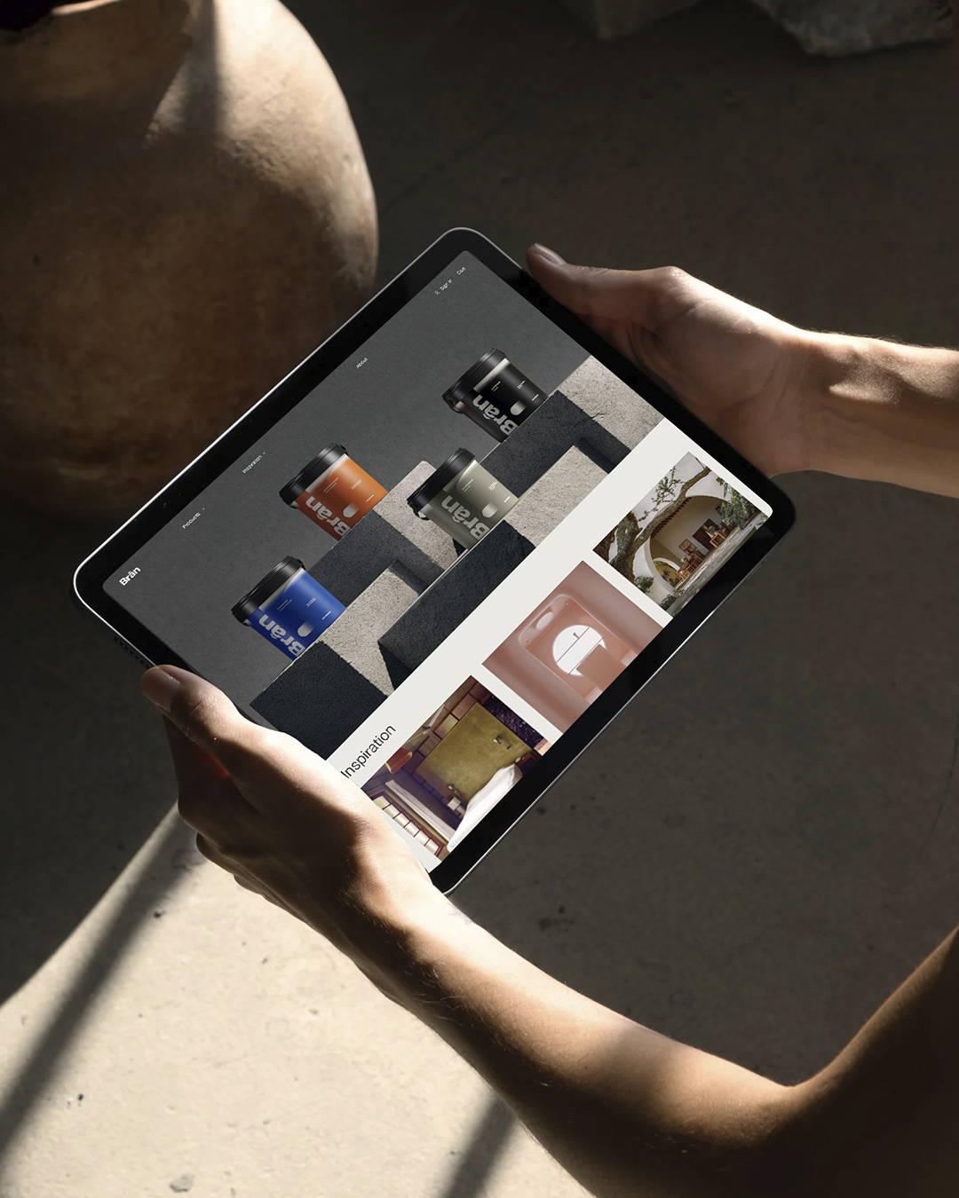
The art direction is intended to be professional, solid and mature. Therefore, we used a neutral and functional sans serif typeface and a range of muted colors that help us differentiate the product categories and at the same time, allow the brand to be perceived as trustworthy and high quality.
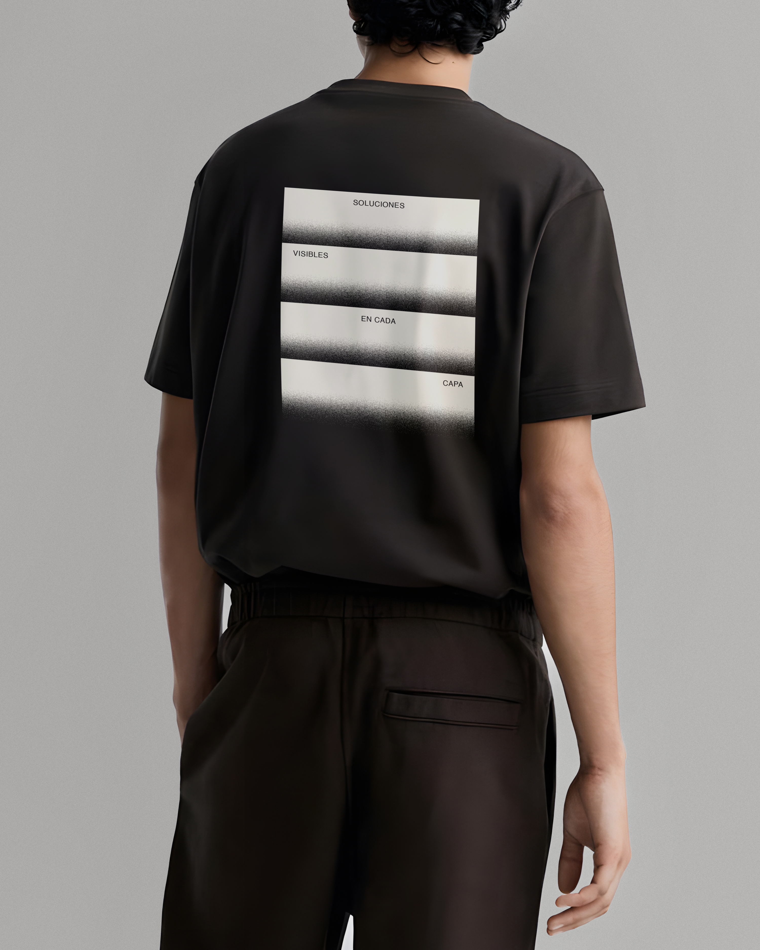
We created a grid system to organize and hierarchize the information in an orderly and rational way from graphic resources inspired by the stroke of the applicator roller, which enriches the visual identity.
↑
See Again


Brân
Brand Identity
Art Direction
Packaging
Brân is a new coating paint brand that wanted to convert the sector by bringing together their expertise of its family business with a much more modern and reliable look. We defined its naming, branding and positioning, art direction and packaging.
Its naming comes from the Welsh god of protection, a name that is easy to pronounce and remember. Its circumflex accent evokes the shape of a roof, making it distinctive and recognizable.
The art direction is intended to be professional, solid and mature. Therefore, we used a neutral and functional sans serif typeface and a range of muted colors that help us differentiate the product categories and at the same time, allow the brand to be perceived as trustworthy and high quality.
We created a grid system to organize and hierarchize the information in an orderly and rational way from graphic resources inspired by the stroke of the applicator roller, which enriches the visual identity.



↑
See Again